Written by: Tech.us Category: Mobile App Development
We build AI-driven solutions that help your business overcome challenges and unlock its full potential. Together, we'll drive growth with innovative technology tailored to your needs.
Artificial Intelligence Services
Machine Learning Services
Generative Al Services
Robotic Process Automation
Natural Language Processing
Chatbot Development Services
Enterprise AI Services
Data Annotation Services
MLOps Services
IoT Services
Data Mining Services
Computer Vision Services
LLM Development Services
AI Agents
Agentic AI Development
Custom Software Development
Enterprise Software Solutions
Software Development Services
Website Development Services
Software Product Development Services
SaaS Development Services
Mobile App Development Services
Custom Mobile App Development
IOS App Development
Android App Development
Enterprise Mobile App Development
Hybrid App Development
Software Development Outsourcing
Dedicated Development Team
Staff Augmentation Services
IT Outsourcing Services
Data Analytics Services
Data Analytics Consulting Services
Business Intelligence Solutions
Software Modernization
Application Modernization Services
Legacy System Modernization
IT Security Solutions
Cyber Security Solutions
Cyber Security Managed Services
HIPAA Compliance Cyber Security
Cloud Application Development
Custom Web Application Development
Cloud Consulting Services
AWS Cloud Consulting Services
Enterprise Cloud Computing
Azure Cloud Migration Services

POPULAR POSTS
01
How To Improve Document Processing Accuracy Using Document AI
02
11 Proven Benefits of AI Chatbots for Businesses in 2025
03
Top 10 Companies Offering Software Modernization Consulting Services in 2026
04
What Digital Transformation Means for Businesses in 2026
05
What is Data Mining
Written by: Tech.us Category: Mobile App Development
Our technology landscape continues to shift and evolve with every passing year. 58% of the world’s population are now online. That’s over four billion people on the internet, accessing information, posting content, and engaging in different conversations every day. Thanks to technological innovation, people can access the internet not only on desktop computers but also on their mobile devices. Whether devices run on Android or iOs, people have come to rely on their phones more and more.
In recent years, mobile traffic has steadily increased. You can see this by looking at historical data. In 2013, mobile phones only made up 16.2% of worldwide traffic. By 2020, they were generating 50.81% of all traffic.
Currently, mobile traffic is consistently hovering around the 50% mark. As different tech companies gear towards making 5G a reality, however, you can expect this trend to continue on upwards.
If you’re looking to grow your business and drive it towards success, then optimizing your website for mobile use and having an accessible mobile app could be a game-changer for you. It comes as no surprise that people spend around 90% of their free time on mobile devices using apps. Engagement is also said to be four times better on mobile than on desktop.
You know that having your business available online allows you to tap into great opportunities. Social media drives the heart of even big Fortune 500 companies’ marketing efforts. But what about the way in which people get to access your services, products, and content? Since most of your potential customers are on mobile, it’s only logical that you should shift your strategies to incorporate mobile devices.
Get ahead of the pack. Here are some essential mobile growth hacks that your competitors don’t want you to find out.

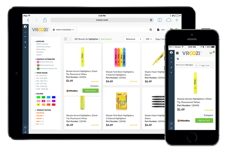
Different mobile devices with varying screen sizes and resolutions saturate the market. Take Apple, for example. Apple’s primary marketing strategy is to create iPhones that cater to their every customer’s needs. May it be in the form of mini pocket-sized phones people can use with one hand or larger than life phones with even bigger, flashier screens. Let’s not get even started with the Android market.
You must always first consider how your mobile app or mobile-optimized website would look on these devices. There are different screen sizes and resolutions that every mobile app developer worth their salt must consider.
An excellent user experience and attractive user interface design will entice people to stay longer and interact more with your brand. You want to capture and retain their attention. Making sure your app is well-adapted to different screen sizes ensures that.

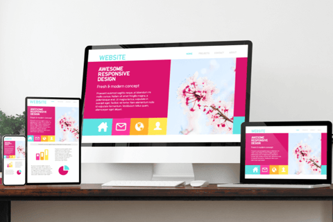
Having a mobile responsive design for your website is always a good move. A responsive design conforms to any screen size. However, a responsive design does not suddenly equal mobile optimization. Mobile optimization simply begins with a responsive design. Think of this design as your building blocks in creating a mobile-friendly interface.
The main difference between having a mobile-optimized design and a standard website is the customization for mobile users. Websites optimized for mobile make navigation far simpler with their intuitive design and easy to use UI. They also often have a separate URL.
Here’s a protip: WordPress has free themes you can use to incorporate responsive designs to your website.

Only a few are taking advantage of this feature to get ahead on search engine results pages (SERPs). But to understand this concept, however, you must first understand what a rich snippet is.
A rich snippet is a piece of schema markup or HTML code that you can add to your website. This code gives search engines more information and allows them to explore your website faster. Once the structured data gets implemented, Google or other search engines can rank you more accurately because they’re able to understand your page’s intent and its contents better.
How does this help you? Rich snippets typically appear above paid and organic results. For example, if you sell athletic wear, people might find your content on exercise routines and fitness in a rich snippet. Having strategic search engine optimization (SEO) can drive a high volume of traffic to your website, whether on mobile or desktop. SEO makes your mobile app and website easier for people to find. Visibility is another key you must continuously use as leverage.
To find the schema markup you need for structured data, you can use Schema.org.

When it comes to mobile growth hacks, and even any other growth hacks, it’s always best to go back to this
question: What do your users want?
One thing that they definitely don’t want is a slow loading speed. You want to deliver your desired user experience as fast as possible. Again, it would be best if you went back to the user’s mindset. Users these days are impatient. As soon as they hit the app icon or the link to your website, it should load within the next few seconds. Failing to do so will lead to people automatically closing the app. Slow speed increases your bounce rate and decreases the time users could’ve spent engaging with your brand.
The common culprits behind slow page speed are large image files that take a while to load. To have a smooth user experience, you need to use smaller images. While you want your users to see large enough pictures of the products you sell, they need to be small enough to have an insignificant impact on your page’s loading speed. Graphics shouldn’t be overwhelming and weigh down your site or app.

AMP or Accelerated Mobile Pages are mobile-optimized versions of websites. You can add AMP functionality to WordPress via plugins.While AMP changes your website’s look and functionality when viewed on mobile, it’s still customizable to get the look that you want.
AMP loads faster than your ordinary websites. It brings up a lighter version of the website that has been cached. It’s essential to take note that Google’s algorithm values faster loading speeds. It tends to favor AMP websites over normal ones since users tend to stay longer and interact more with them.
Having an AMP-supported website is a great supplement to go with your mobile app when driving traffic and generating conversions. You can promote your mobile app on the website and publish relevant content to support your brand. Having a fast loading website on mobile pushes your business to rank higher and get ahead of the competition.

When it comes to mobile apps, accessibility is a necessity. Great app designers and developers put lots of effort into even the tiniest elements such as button sizes. This is because you must leverage on being user-friendly. Having positive experiences on your app not only leaves you with good customer feedback, but you’re also building strong brand credibility.
Moreover, mobile apps often require different permissions from users for better accessibility. So, even from the ideation phase, you need to have a clarity about what kind of permissions you may need to add during the development process to ensure users clearly understand why apps keep asking permissions from them. This helps create a sense of trust and credibility.
Mobile app designs are probably one of the trickiest things to nail down properly. Not all users will hold their phones the same way. Some might use two hands, and others might only use one. What distinguishes excellent 5-star apps from good ones is being friendly to both left-handed and right-handed people.
Keep the hand and finger placement right at the forefront of your mind when designing the app. Bonus points if you can also add accessibility features for users with disabilities, such as enabling your users to change the font size on the screen if they’re visually impaired, for instance.
You might be surprised at how these small touches can matter the most.

Your regular smartphone user will use an average of 26.7 apps per month. Apps are being developed left and right because of how strong the market demand is. The competition is steep. You can have the coolest app and a great looking website that loads quickly on mobile, but if people don’t know that it exists or where to find it, you might have just spent all of that money and time for nothing.
That’s why having a solid marketing plan in place is vital. Companies tend to spend all their efforts on developing an app or streamlining their mobile websites without having a plan. Creating a strong marketing campaign allows you to convince existing and potential customers why they need your services or products.
Determine your goals first. What do you want to achieve? Is it to increase app downloads? Do you want to drive more traffic to your website? Do you want to grow online engagement with your business? Once you have these finer details nailed down, you can begin to develop your strategies to tap into your customers.
Find the right platforms. This minimizes the effort of having to be everywhere at once while still making sure that you’re capturing your target market. Utilize the necessary tools such as Facebook ads to make sure your app is visible. Create the need that pushes your audience to download your app or click on your link.

User behavior is ever-changing, and the trend is pointing more and more towards mobile phones. We are shifting to a world where everything we consume is optimized for mobile consumption. Phones have become an integral part of society, and they aren’t leaving anytime soon. If you pass up on tapping into the incredible opportunity of integrating mobile apps with your business, you’re most likely leaving money on the table.
The future is mobile. The only question here is: will you be a part of this future, or will you get left behind?

How to Successfully Outsource PHP Development Projects

How Artificial Intelligence Is Making The World A...
Get Free Tips
NEWSLETTER
Get Free Tips
Submit to our newsletter to receive exclusive stories delivered to vou inbox!
Thanks for submitting the form.
RECENT POSTS

7 Mistakes to Avoid When Adding AI to Your Existing Software Systems

7 Key Benefits of Working with an AI Software Development Company in 2026

How AI Software Development Can Revolutionize Your Business Operations in...

Cloud Migration vs Legacy Modernization: Understanding the Difference

What is Legacy System Modernization? The Complete Guide for Business...
We build AI-driven solutions that help your business overcome challenges and unlock its full potential. Together, we'll drive growth with innovative technology tailored to your needs.